Hi there. Can I change the default style of this attribute from a check box to a toggle button or state button? Where can I find the code to modify this.
Thanks.
Hi there. Can I change the default style of this attribute from a check box to a toggle button or state button? Where can I find the code to modify this.
Thanks.
You can add a configuration item to an attribute to show it as an “on off button”.
Follow the steps below:
.
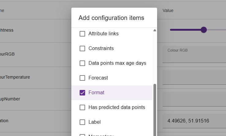
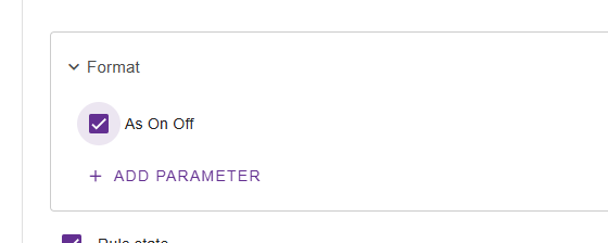
Press the “add configuration items” button on your attribute.
Select “Format”
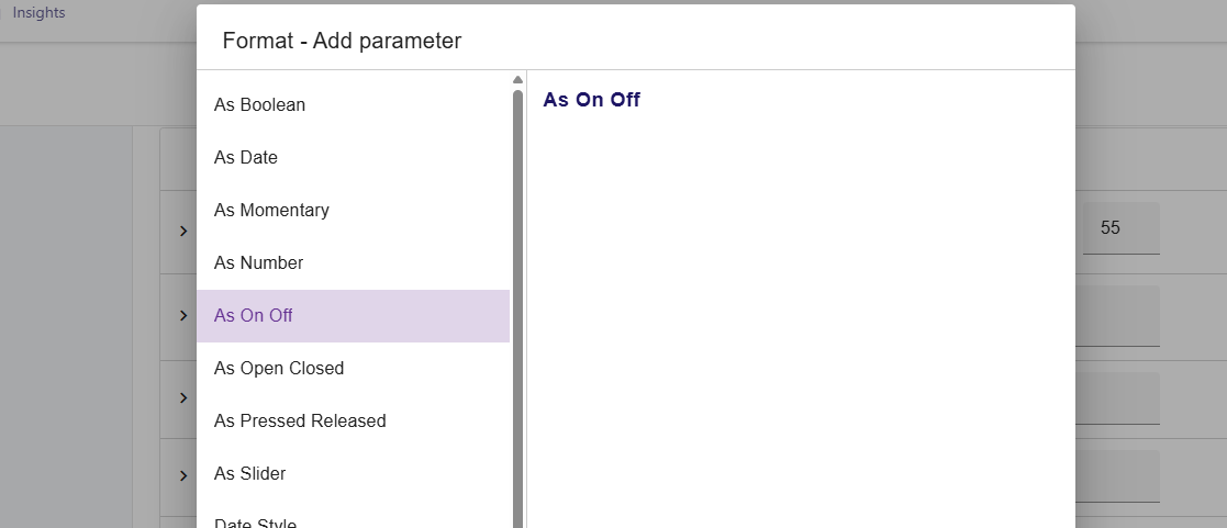
Then configure the format, by adding a parameter. Choose “As On Off”
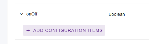
Don’t forget to enable it 
Hope this helps!
Oh btw, for custom asset types you can also add this configuration item by default using
.withFormat(ValueFormat.BOOLEAN_ON_OFF()) in the code.
Thanks Martin. Is there any way for the on/off text to appear on toggle?
I’m not sure what you mean.
Can you give an example or screenshot of what you’re trying to achieve?
I have selected the toggle button as per your example, which works fine. I was also expecting the option for on/off text appearing when toggled. If not, is there access to the code to customise further?
Like this:
The on off button is based on the Material 2 UI style by Google;
There is no easy option to add a “background text” to the button,
other than modifying the codebase and doing something yourself.
Unfortunately this is not easy 
You can check the /ui/component/or-mwc-components/or-mwc-input code,
and make your changes there. However, be aware of our AGPLv3 license.
Thanks again! I’ll take a look and noted re. license.
This topic was automatically closed 90 days after the last reply. New replies are no longer allowed.